Animations Guide
Overview
The Fitbit rendering engine provides two incredibly powerful ways to animate user interface elements: Property Animations and Transformation Animations.
Property Animations
Property animations allow the simple manipulation of an element's attributes. For example, changing the opacity, or the coordinates of an element.
To create a property animation, the <animate> element should be added as a
child of the element you want to animate.
Supported attributes:
attributeName: The name of the attribute you will be animating.beginandend: specify the event(s) that start and end the animation.final: (freeze|remove|restore|keep). specifies the value of the attribute once the animation ends.easing: (linear|ease|ease-in|ease-out|ease-in-out|ease-out-in) can be used to specify a non-linear change in the animation.dur: can be used to specify a duration.repeatCount(number | indefinite) orrepeatDur(seconds): can be used to repeat the animations.
Opacity Animation
In the following example, when the <rect> element is touched, its opacity will
animate from 1 (visible) to 0 (transparent), for a duration of 3 seconds.
Once the animation has completed, the opacity will be restored to its initial
value.
<svg>
  <rect x="15%" y="30%" width="70%" height="40%" fill="fb-green" pointer-events="visible">
    <animate attributeName="opacity" begin="click" from="1" to="0" dur="3" final="restore" />
  </rect>
</svg>

Coordinate Animation
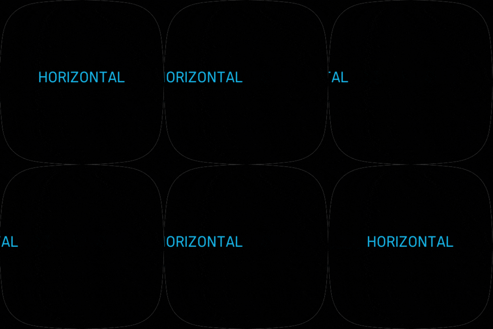
In the next example, when the <text> element is touched, it will move
horizontally on the x axis, from the center of the screen (50%), to the left
of the screen (-50%).
By adding a second animation, the element will animate back to its original
position 2 seconds after the first click event.
<svg>
  <text x="50%" y="50%" fill="fb-cyan" text-anchor="middle" pointer-events="visible">HORIZONTAL
    <!-- fly-out -->
    <animate attributeName="x"  begin="click" from="50%" to="-50%" dur="2" />
    <!-- fly-in -->
    <animate attributeName="x"  begin="click+2" to="50%" from="-50%" dur="2" />
  </text>
</svg>

Multiple Animations
More than one property can be animated at any one time, and as in the previous example, additional events can be chained together, so they occur after an initial event.
In the following example, the <text> will fly-out horizontally, then fly-in
again afterwards. Whilst this is happening, the opacity will also be animating,
to fade the element out, then in.
<svg>
  <text x="50%" y="50%" fill="fb-yellow" text-anchor="middle"
        pointer-events="visible">HORIZONTAL
    <!-- fly-out -->
    <animate attributeName="opacity" begin="click" from="1" to="0" dur="2" />
    <animate attributeName="x"  begin="click" from="50%" to="-50%" dur="2" />
    <!-- fly-in -->
    <animate attributeName="opacity" begin="click+2" to="1" from="0" dur="2" />
    <animate attributeName="x"  begin="click+2" to="50%" from="-50%" dur="2" />
  </text>
</svg>

Transformation Animations
Transformation animations allow an element to be easily translated (moved), scaled and rotated.
The <animateTransform> element must be added as a child of a <g> element,
alongside the elements you want to manipulate.
Supported attributes:
attributeType: specifies the transformation to animate:translate,rotate, orscale.fromandto: specify the start and end values.beginandend: specify the event(s) that start and end the animation.final: (freeze|remove|restore|keep). specifies the value of the attribute once the animation ends.easing: (linear|ease|ease-in|ease-out|ease-in-out|ease-out-in) can be used to specify a non-linear change in the animation.dur: can be used to specify a duration.repeatCount(number | indefinite) orrepeatDur(seconds): can be used to repeat the animations.
Transformations
Transformations are supported when using the x,y coordinate system.
translate(tx | tx, ty): specifies a translation by tx and ty. If ty is
not provided, it is assumed to be zero.
scale(s | sx, sy): specifies a scale operation by s in both X and Y axes,
or if two parameters are provided, by sx in the X axis and sy in the Y
axis.
rotate(angle | angle, cx, cy): specifies a rotation by angle degrees about a
given poin cx, cy. If the optional coordinate parameters are not supplied,
the rotation is about the origin of the element.
Translation Animation
When using attributeType="translate", the from and to expects coordinate
values. e.g. x,y,z. If only one coordinate is specified, then the others are
assumed to be 0. If only one coordinate is to be animated, the other values
should be specified. z is 0 if not specified.
In the following example, when the <g> element is clicked, the <circle> will
move from one side of the screen, to the other, then back again.
<svg>
  <g transform="translate(45,50%)" pointer-events="visible">
    <animateTransform attributeType="translate"
      from="45,50%" to="100%-45,50%" begin="click" dur="2" />
    <animateTransform attributeType="translate"
      to="45,50%" from="100%-45,50%" begin="click+2.5" dur="1" />
    <circle cx="0" cy="0" r="40" fill="fb-cyan"/>
  </g>
</svg>

Scaling Animation
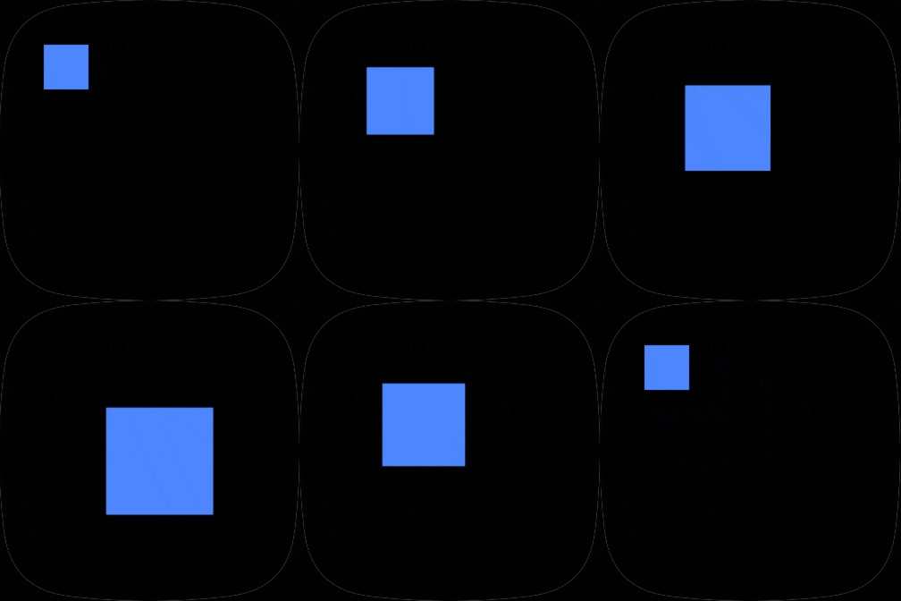
When using attributeType="scale", the from and to expects scale factors.
e.g. sx,sy,sz. If only one value is specified, the result is uniform scaling.
In the following example, the text will get bigger, then smaller, then return to its original size.
<svg>
  <g pointer-events="visible">
    <animateTransform attributeType="scale" from="1" to="2.5"  begin="click"  dur="2" />
    <animateTransform attributeType="scale" from="2.5" to="1"  begin="click+2" dur="1" />
    <rect x="50" y="50" width="50" height="50" fill="fb-blue" />
  </g>
</svg>

Rotation Animation
When using attributeType="rotate", the from and to expects an angle (0
to 360).
In the following example, the rect will rotate 360 degrees when clicked.
We're using the transform translate to position the g element within the
centre of the screen. In order to rotate around the centre point of the
rectangle, we need to position our rect element within the centre of the g
element.
<svg>
  <g pointer-events="visible" transform="translate(50%,50%)">
    <animateTransform attributeType="rotate" from="0" to="360" begin="click" dur="3" />
    <rect x="$-100" y="$-100" width="200" height="200" fill="fb-red" />
  </g>
</svg>

Events
Property and transformation animations both support the same events which can trigger the beginning and end of an animation.
These events are as follows:
activate: System event triggered when a component is activated.click: Event generated when the element is touched (aftermouseup).disable: Event generated when an element is disabled.enable: Event generated when an element is enabled.load: Event generated when the component is loaded.mousedown: Pointer event indicating that a touch down was detected.mousemove: Pointer event indicating that a touch point has moved.mouseup: Pointer event indicating that a touch is no longer detected.
Multiple events can be specified by separating them with a semicolon.
e.g. begin="load;enable"
JavaScript Animations
Triggering Animations
JavaScript can trigger the animations on the <use> of a template symbol.
So, in order to trigger an animation from JavaScript, we must first create a
Template Symbol containing the <animate> or
<animateTransform> elements, then create a <use> instance of it.
<svg viewport-fill="lightblue">
  <defs>
    <symbol id="demo">
      <g id="demogroup">
        <circle cx="50%" cy="50%" r="50" fill="red" />
        <animate attributeName="opacity" begin="enable"
            from="1" to="0" dur="3" final="restore" />
      </g>
    </symbol>
  </defs>
  <svg width="100%" height="100%">
    <use id="demoinstance" href="#demo" width="100%" height="100%" />
  </svg>
</svg>
To trigger the animation, call the animate() method on the instance, passing
the type of event to send:
import * as document from "document";

// Get a handle on the instance
var demoinstance = document.getElementById("demoinstance");

// Animate after a 5 second delay
setTimeout(() => {
  demoinstance.animate("enable"); // Specify the name of the event to trigger
}, 5000);
The standard types of events are as follows: activate, click, collapse,
disable, enable, expand, highlight, load, mousedown, mousemove,
mouseout, mouseover, mouseup, paint, reload, select, unhighlight,
unload, and unselect.
Transformations
Developers can manipulate <g> element transformations using JavaScript to
manually translate, scale, and rotate elements.
Translation Animation
import * as document from "document";

// Get a handle on the <g> instance
var demoinstance = document.getElementById("demoinstance");
var demogroup = demoinstance.getElementById("demogroup");

demogroup.groupTransform.translate.x = 20;
demogroup.groupTransform.translate.y = 20;
Scaling Animation
Scale an element to 50%.
import * as document from "document";

// Get a handle on the <g> instance
var demoinstance = document.getElementById("demoinstance");
var demogroup = demoinstance.getElementById("demogroup");

demogroup.groupTransform.scale.x = .5;
demogroup.groupTransform.scale.y = .5;
Rotation Animation
import * as document from "document";

// Get a handle on the <g> instance
var demoinstance = document.getElementById("demoinstance");
var demogroup = demoinstance.getElementById("demogroup");

demogroup.groupTransform.rotate.angle = 45;


