SVG Guide
Overview
The user interface in a Fitbit application is described in SVG files, which is based upon the internet standard for scalable vector graphics.
<svg>
  <image href="my-image.jpg" />
  <text fill="red" font-family="System-Regular">Hello World!</text>
</svg>
Fitbit OS projects typically contain two SVG files by default, but additional files can be added and imported, or used within the document view stack.
In Fitbit OS 5, the default SVG files are index.view which contains the
default view for your app or clock face, and widget.defs which contains
default imports and symbol definitions.
Note: In Fitbit OS 4, the default files are
index.guiandwidgets.gui.
Coordinates and Encapsulation
There are a few basic principles of SVG that are important to understand.
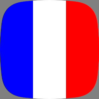
First, the x and y coordinates are always expressed from the top-left corner
of the screen. For example, to display a French flag:
<svg>
  <rect x="0"   y="0" width="112" height="100%" fill="blue" />
  <rect x="112" y="0" width="112" height="100%" fill="white" />
  <rect x="224" y="0" width="112" height="100%" fill="red" />
</svg>
Another important concept is the use of percentage in place of x, y, width
or height.
<svg>
  <rect x="0"   y="0" width="33%" height="100%" fill="blue" />
  <rect x="33%" y="0" width="34%" height="100%" fill="white" />
  <rect x="67%" y="0" width="33%" height="100%" fill="red" />
</svg>
You can also combine percentages and pixels in the same value. For example
30%+15 or 30%-15. These calculated values cannot contain spaces.
Some elements create a new coordinate context and you can encapsulate other
elements in them. The most generic element that creates a new coordinate system
is <svg>.
When inserted into such an element, the x and y coordinates of the child
element are relative to the parent element. Percentages will also be relative to
the parent.
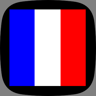
<svg>
  <svg x="10%" y="10%" width="80%" height="80%" fill="black">
    <rect x="0"   y="0" width="33%" height="100%" fill="blue" />
    <rect x="33%" y="0" width="34%" height="100%" fill="white" />
    <rect x="67%" y="0" width="33%" height="100%" fill="red" />
  </svg>
</svg>
Lines
The <line> element draws a line between two pairs of coordinates.
x1,y1: the start point of the line.x2,y2: the end point of the line.fill: specifies the line fill color.stroke-width: the thickness of the line. Maximum 32.stroke-linecap:roundorbutt, defaults toround, specifies if the end caps of lines should be rounded or squared.opacity: specifies the opacity of the line (between0and1).visibility: specifies if the line should bevisibleorhidden.display:none,inlineorinherit.
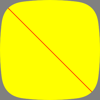
The following example draws a simple diagonal line across the screen.
<svg viewport-fill="yellow">
  <line x1="10" y1="10" x2="100%-10" y2="100%-10" fill="red" stroke-width="2" />
</svg>
Rectangles
The <rect> element allows you to draw rectangles on the screen.
Supported attributes:
xandy: position of the left, top-most corner.widthandheight: specify the rectangle's size.fill: specifies the rectangle fill color.opacity: specifies the opacity of the rectangle (between0and1).visibility: specifies if the rectangle should bevisibleorhidden.display:none,inlineorinherit.
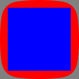
<svg viewport-fill="red">
  <rect x="10%" y="10%" width="80%" height="80%" fill="blue" />
</svg>
Circles
Attributes
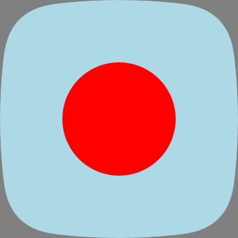
cx,cy: coordinates of the centerxand centeryof the circle.r: radius of the circle.
<svg viewport-fill="lightblue">
  <circle cx="50%" cy="50%" r="80" fill="red" />
</svg>
Images
You can display images in your application in either PNG or JPEG formats. PNG format is preferable as it is compiled into a hardware accelerated TXI format during compilation. JPEG files are smaller, but take longer to render. Note that Progressive JPEG files are not supported.
Attributes
x,y: position of the left, top-most corner.width,height: specify the size of the image.
You must specify the size of the image. If you use a percentage, it will be relative to the parent container.
<svg viewport-fill="gray">
  <image x="68" y="68" width="200" height="200" href="icon.png" />
</svg>

Text
A single line of text.
Attributes
x,y: coordinates of the anchor point.fill: color of the text.text-anchor: can bestart,middle,end.text-buffer: holds the text string.text-length: specifies the number of characters to reserve for the text string. Will be rounded up to a multiple of 4.letter-spacing: in pixels.text-overflow: can becliporellipsis.font-family: specifies the font to use.font-size: specifies the font size in pixels.font-weight: specifies the character outline thickness (light,regular, orbold).text-decoration: specifies the if the text will be underlined or not.
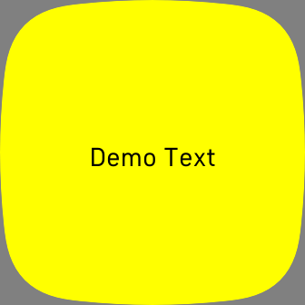
<svg viewport-fill="yellow">
  <text x="50%" y="50%+15"
        font-family="System-Regular" fill="black"
        font-size="30" font-weight="bold"
        text-anchor="middle">Demo Text</text>
</svg>
When placing <text> elements, you are specifying the x and y coordinate of
the anchor point. By default the anchor is the left side of the text baseline.
The baseline is at the bottom of the text. This means that a text element,
placed at 0,0 will not be visible on screen because the text will be drawn
above the baseline.
Textarea
While <text> should be used for a single line of text, the <textarea>
element displays text over multiple lines.
Attributes
x,y: coordinates of the anchor point.width: specifies the maximum width of the display area.height: specifies the maximum height of the text, and the default is derived from the font filefill: color of the text.text-anchor: can bestart,middle,end.text-buffer: holds the text string.text-length: specifies the number of characters to reserve for the text string. Will be rounded up to a multiple of 4.letter-spacing: in pixels.text-overflow: can becliporellipsis.font-family: specifies the font to use.font-size: specifies the font size in pixels.font-weight: specifies the character outline thickness (light,regular, orbold).text-decoration: specifies the if the text will be underlined or not.display-align: specifies the vertical alignment (before,center,after).line-increment: specifies the line, or row height.rows: constrains the number of rows.
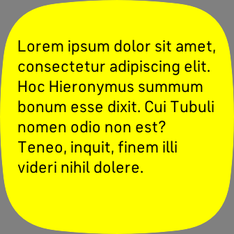
<svg viewport-fill="yellow">
  <textarea x="25" y="50" width="100%-50"
    font-family="System-Regular" fill="black" font-size="24">Lorem ipsum dolor
    sit amet, consectetur adipiscing elit. Hoc Hieronymus summum bonum esse
    dixit. Cui Tubuli nomen odio non est? Teneo, inquit, finem illi videri nihil
    dolere.</textarea>
</svg>
When placing <textarea> elements, you are specifying the x and y
coordinate of the top left anchor point. This is not the baseline coordinate.
Text will automatically wrap, or you can add a carriage return within the text to add a line break. If you want to add a line break in JavaScript use
\n.
Dynamic Textarea
The dynamic-textarea type can be used to create a <textarea> which
dynamically adjusts the height depending on the length of the text content. If
you change the text content, the element height will automatically re-adjust.
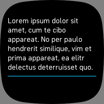
In the following example we define a Template Symbol
containing a <textarea> and a <rect>. The <rect> will always appear 15
pixels below the <textarea> even if the text content is changed at runtime.
<svg>
  <defs>
    <symbol id="custom-textarea" type="dynamic-textarea" system-events="all">
      <textarea id="text" fill="white" x="0" y="0" width="100%" font-size="25" />
      <rect x="0" y="$+15" width="100%" height="2" fill="fb-cyan" />
    </symbol>
  </defs>

  <use id="custom" href="#custom-textarea" x="25" y="50" width="100%-50">
    <set href="text" attributeName="text-buffer" to="Lorem ipsum dolor sit amet,
    cum te cibo appareat. No per paulo hendrerit similique, vim et prima
    appareat, ea elitr delectus deterruisset quo." />
  </use>
</svg>
Arc
Draws an arc, circular or elliptical.
Attributes
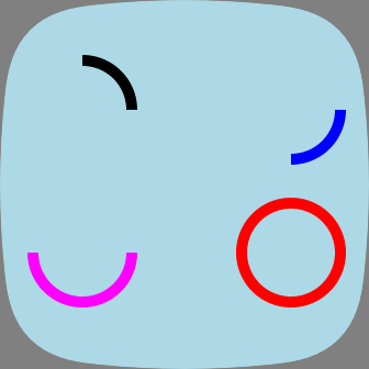
arc-width: arc thickness in pixels, or%-expression. Maximum 31.start-angle: start angle in degrees, with 0 at 12 o'clock.sweep-angle: length of the arc in degrees.
<svg viewport-fill="lightblue">
  <arc x="25" y="50" width="100" height="100" fill="black"
    arc-width="10" start-angle="0" sweep-angle="90" />
  <arc x="215" y="50" width="100" height="100" fill="blue"
    arc-width="10" start-angle="90" sweep-angle="90" />
  <arc x="25" y="180" width="100" height="100" fill="magenta"
    arc-width="10" start-angle="90" sweep-angle="180" />
  <arc x="215" y="180" width="100" height="100" fill="red"
    arc-width="10" start-angle="0" sweep-angle="360" />
</svg>
Defs
<defs> is a container element that should be used to include <symbol> and
stylesheet definitions that will be used by the document.
Elements placed inside the <defs> container are not rendered.
Attributes
The defs element has no attributes.
Section
This element is a container that can be used instead of the <svg> when only
position and size properties of the container are required. It establishes a new
coordinate system for the element it contains.
The <section> element has less attributes than <svg> and, therefore,
consumes less memory.
Attributes
x,y: position of the left, top-most corner.width,height: specify the size of the element.
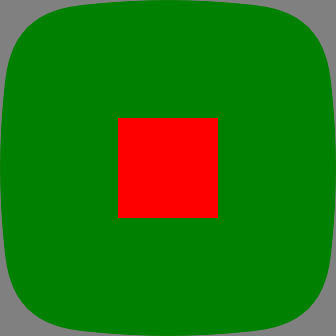
<svg viewport-fill="green">
  <section x="50%-50" y="50%-50" width="100" height="100">
    <rect width="100%" height="100%" fill="red" />
  </section>
</svg>
G Container
The <g> container can be used to translate (move), rotate, and/or scale, all
of the elements it contains.
The transformations are applied to the coordinates of its child elements.
The <animateTransform> can be used to animate the <g> transformations. It is
the only element that supports rotation and the only one that can be a valid
parent of <animateTransform>.
Translate (move)
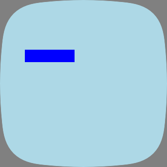
<svg viewport-fill="lightblue">
  <g transform="translate(50,100)">
   <rect x="0" y="0" width="100" height="25" fill="blue" />
  </g>
</svg>
Rotate
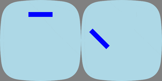
<svg viewport-fill="lightblue">
  <g transform="rotate(45)">
    <rect x="50%-50" y="50" width="100" height="20" fill="blue" />
  </g>
</svg>
Scale
<svg viewport-fill="lightblue">
  <g transform="scale(2.3)">
    <rect x="10%" y="50" width="100" height="20" fill="blue" />
  </g>
</svg>
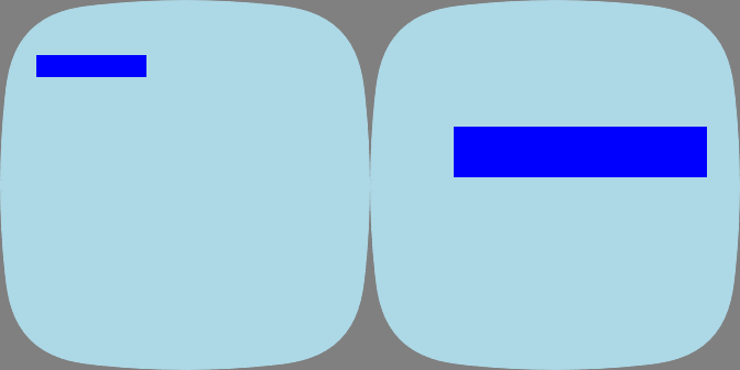
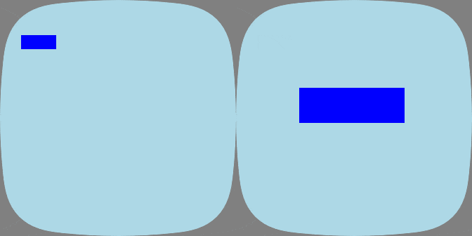
The syntax scale(factor) implies uniform scaling: all coordinates are scaled
by the same amount. Non-uniform scaling is done when individual scaling factors
are specified: scale(x,y,z). Use 1 to prevent scaling.
<svg viewport-fill="lightblue">
  <g transform="scale(3,2.5,1)">
    <rect x="30" y="50" width="50" height="20" fill="blue" />
  </g>
</svg>
Gradient Rectangle
The <gradientRect> element fills a rectangle with a color texture, without the
use of a bitmap. It can blend two colors when the gradient type is linear or
radial, or four colors when the type is bilinear.
Attributes
gradient-x1,gradient-y1: define the first set of coordinates.gradient-x2,gradient-y2: define the second set of coordinates.gradient-type: the type of effect to use,linear,radial, orbilinear.gradient-color1,gradient-color2: specify colors that are used in all gradient types.gradient-color3,gradient-color4: specify colors that are only used inbilineargradients.gradient-opacity[1-4]: each gradient color can also have opacity.
Note that for linear and radial gradients, gradient-x1 must be less than
or equal to gradient-x2 and, similarly, gradient-y1 <= gradient-y2.
bilinear gradients require that gradient-y1 < gradient-y2 and
gradient-y1 < gradient-y2.
Linear Gradients
<svg>
  <gradientRect width="100%" height="100%"
    gradient-type="linear"
    gradient-x1="0" gradient-y1="50"
    gradient-x2="0" gradient-y2="100%-50"
    gradient-color1="magenta" gradient-color2="red" />
</svg>

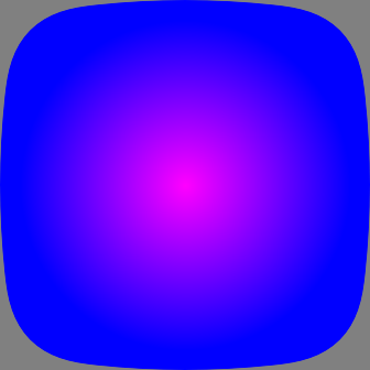
Radial Gradients
<svg>
  <gradientRect x="0" y="0" width="100%" height="100%"
    gradient-type="radial"
    gradient-x1="50%" gradient-y1="50%"
    gradient-x2="50%+150" gradient-y2="50%+150"
    gradient-color1="magenta"
    gradient-color2="blue" />
</svg>
Bilinear Gradients
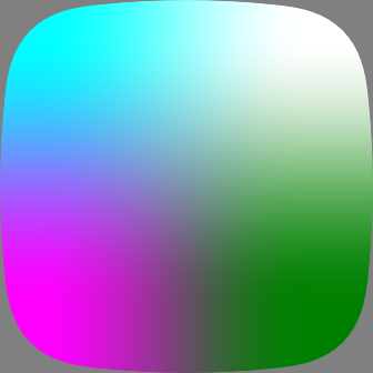
<svg>
  <gradientRect x="0" y="0" width="100%" height="100%"
    gradient-type="bilinear"
    gradient-x1="30" gradient-y1="30"
    gradient-x2="100%-60" gradient-y2="100%-60"
    gradient-color1="cyan"
    gradient-color2="white"
    gradient-color3="magenta"
    gradient-color4="green" />
</svg>
Mask
<mask> is a container element that creates a mask which can be used by <svg>
elements for visual effects. It can contain any graphical elements or container
elements such as <g>.
The <svg> element that uses the mask element will be painted through the mask.
Only the overlapping areas will remain.
In the following example, we define a <mask> with 4 rectangles, then use the
mask by setting the mask attribute to the #id of the mask. Only the masked
areas of the <gradientRect> will be visible.
<svg viewport-fill="#222">
  <mask id="mask">
    <rect x="50%+15" y="50%"  width="60" height="10" />
    <rect x="$-160"  y="$-10" width="60" height="10" />
    <rect x="$+15"   y="$-85" width="10" height="60" />
    <rect x="$-10"   y="$+40" width="10" height="60" />
  </mask>
  <svg mask="#mask" width="100%" height="100%">
    <gradientRect width="100%" height="100%" fill="cyan"
      gradient-type="bilinear"
      gradient-x1="10%" gradient-y1="10%"
      gradient-x2="80%" gradient-y2="80%"
      gradient-color2="yellow"
      gradient-color3="magenta"
      gradient-color4="green" />
  </svg>
</svg>

Template Symbols
By defining an element as a <symbol>, developers can reuse that same element
multiple times without having to duplicate the same markup. The <set> element
can be used to modify attributes of each instance of the <symbol>.
First we need to define our reusable symbol. We'll create 2 <line> elements
inside our <symbol>:
<svg width="348" height="250" viewport-fill="lightblue">
  <defs>
    <symbol id="lines">
      <line id="vertical" x1="50%" x2="50%" y1="0" y2="100%" fill="inherit" />
      <line id="horizontal" x1="0" x2="100%" y1="50%" y2="50%" fill="inherit" />
    </symbol>
  </defs>
</svg>
Then in order to use our symbol, we just need to <use> it as follows:
<use href="#lines" fill="black" />
<use href="#lines" x="50%-10" y="50%-10" fill="red" width="50" height="50" />
If we want to modify any of the attributes, we can specify them with <set>:
<use href="#lines">
  <set href="vertical" attributeName="fill" to="blue" />
  <set href="horizontal" attributeName="fill" to="red" />
</use>


