Button Components Guide
Overview
Buttons represent the most common user interaction method within applications in Fitbit OS.
Common Options
There are a large amount of options for using buttons within an application. This guide provides practical examples of each style. There are some aspects that are common to all buttons:
Styling
The Text Button styling is inherited from the system text-button styling, and
developers can define the following classes to control the colors of their
button throughout the application.
.application-fill           { fill: fb-yellow; }
.foreground-fill            { fill: fb-white; }
.background-fill            { fill: fb-black; }
Developers should import the system definitions in their widget.defs file in
order to use the associated helper CSS classes.
<link rel="import" href="/mnt/sysassets/system_widget.defs" />
Button Text
Developers can set the button's text in 3 different ways:
- To set the text of a button via SVG, use the
<set>tag to update the<text>element with an ID of#text:
<use href="#text-button">
  <set href="#text" attributeName="text-buffer" to="BUTTON" />
</use>
- To set the button text via CSS, use the
text-bufferattribute on the element with an ID of#text:
#myButton #text {
  text-buffer: "BUTTON";
}
- To set the text of a button via JavaScript, get a handle on the element, then
set the
.textproperty:
import * as document from "document";
const myButton = document.getElementById("myButton");
myButton.text = "BUTTON";
Click Events
The button click event occurs when a user presses a button with their finger:
import * as document from "document";
const myButton = document.getElementById("myButton");

myButton.addEventListener("click", (evt) => {
  console.log("CLICKED");
})
Text Button
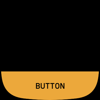
The text-button component will render a single button which can trigger the
click event.
Imports
In addition to any existing imports, developers must include the following
import within the widget.defs file:
<link rel="import" href="/mnt/sysassets/widgets/text_button.defs" />
Usage
Include the following SVG in the index.view file:
<use id="button-1" href="#text-button" class="text-button bottom application-fill" />
Include the following CSS in the styles.css file:
.application-fill           { fill: fb-yellow; }
.foreground-fill            { fill: fb-white; }
.background-fill            { fill: fb-black; }

#myButton #text {
  text-buffer: "BUTTON";
}
Developers can control the button's physical location using the helper class
toporbottom.
Primary and Secondary Buttons
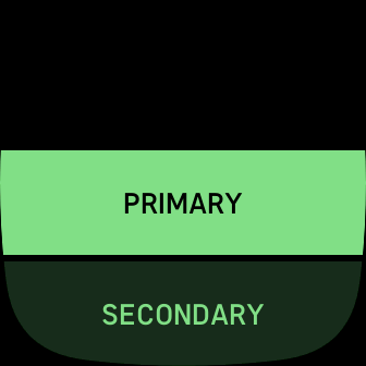
The text-button component can be used to render a primary and secondary
button.
Imports
In addition to any existing imports, developers must include the following
import within the widget.defs file:
<link rel="import" href="/mnt/sysassets/widgets/text_button.defs" />
Usage
Include the following SVG in the index.view file:
<use id="button-1" href="#text-button" class="text-button primary application-fill" />
<use id="button-2" href="#text-button" class="text-button secondary application-fill" />
Include the following CSS in the styles.css file:
.application-fill           { fill: fb-mint; }
.foreground-fill            { fill: fb-white; }
.background-fill            { fill: fb-black; }

#button-1 #text {
  text-buffer: "PRIMARY";
}
#button-2 #text {
  text-buffer: "SECONDARY";
}
Left and Right Buttons
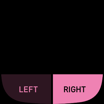
The text-button component can render buttons side by side.
Imports
In addition to any existing imports, developers must include the following
import within the widget.defs file:
<link rel="import" href="/mnt/sysassets/widgets/text_button.defs" />
Usage
Include the following SVG in the index.view file:
<use id="button-1" href="#text-button" class="text-button bottom left secondary application-fill" />
<use id="button-2" href="#text-button" class="text-button bottom right application-fill" />
The button's physical location is controlled using the helper class
leftorright, and the classbottom.
Include the following CSS in the styles.css file:
.application-fill           { fill: fb-pink; }
.foreground-fill            { fill: fb-white; }
.background-fill            { fill: fb-black; }

#button-1 #text {
  text-buffer: "LEFT";
}

#button-2 #text {
  text-buffer: "RIGHT";
}
Developers can control the button's physical location using the helper class
toporbottom.
Textarea Button
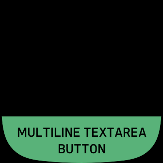
The text-button component can be used to render a button that contains text
which spans multiple lines.
Imports
In addition to any existing imports, developers must include the following
import within the widget.defs file:
<link rel="import" href="/mnt/sysassets/widgets/text_button.defs" />
Usage
Include the following SVG in the index.view file:
<use id="button-1" href="#textarea-button" class="text-button bottom application-fill" />
Include the following CSS in the styles.css file:
.application-fill           { fill: fb-green; }
.foreground-fill            { fill: fb-white; }
.background-fill            { fill: fb-black; }

#button-1 #text {
  text-buffer: "MULTILINE TEXTAREA BUTTON";
}
Icon Text Button
The icon-text-button component can be used to render a button that has an icon
with text.
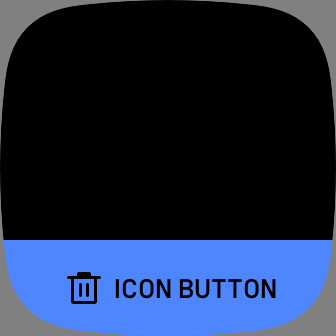
Note: The icon image should be 48x48px grayscale 8-bit PNG to support the fill color. See Grayscale Magic
Imports
In addition to any existing imports, developers must include the following
import within the widget.defs file:
<link rel="import" href="/mnt/sysassets/widgets/text_button.defs" />
Usage
Include the following SVG in the index.view file:
<use id="button-1" href="#icon-text-button" class="icon-text-button bottom application-fill" />
Include the following CSS in the styles.css file:
.application-fill           { fill: fb-blue; }
.foreground-fill            { fill: fb-white; }
.background-fill            { fill: fb-black; }

#button-1 #text {
  text-buffer: "ICON BUTTON";
}

#button-1 #image {
  href: "filename.png";
}
Icon Button
The icon-button component can be used to render a icon button.
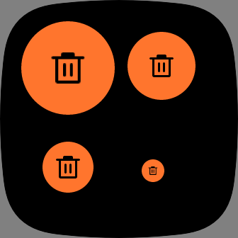
Icon buttons have 4 sizes:
- Extra Large: 132x132
- Large: 96x96
- Medium: 72x72
- Small: 32x32
The icon button images need to be the following sizes to avoid scaling:
- Extra Large image: 66x66
- Large button image: 48x48
- Medium button image: 48x48
- Small button image: 18x18
Note: The icon image should be grayscale 8-bit PNG to support the fill color. See Grayscale Magic
Imports
In addition to any existing imports, developers must include the following
import within the widget.defs file:
<link rel="import" href="/mnt/sysassets/widgets/icon_button.defs" />
Usage
Include the following SVG in the index.view file:
<use id="button-1" href="#icon-button" class="extra-large-button application-fill plus-button" />
<use id="button-2" href="#icon-button" class="large-button application-fill plus-button" />
<use id="button-3" href="#icon-button" class="medium-button application-fill plus-button" />
<use id="button-4" href="#icon-button" class="small-button application-fill plus-button" />
Include the following CSS in the styles.css file:
.application-fill           { fill: fb-orange; }
.foreground-fill            { fill: fb-white; }
.background-fill            { fill: fb-black; }

.plus-button #image {
  href: “filename.png”;
}

// Positioning for demo:
#button-1 {
  x: 30;
  y: 30;
}

#button-2 {
  x: 180;
  y: 45;
}

#button-3 {
  x: 60;
  y: 200;
}

#button-4 {
  x: 200;
  y: 225;
}


